New again – but kind of fancy. Facebook is changing its fan page design again. Fanpages are used by companies, people or projects to attract attention. Unlike private Facebook profiles, no friendships can be made here. Fanpages for companies are small micro-sites on which users can express their interest by “liking”, they can contact or call up further information. From old, make new! Today after no small changes were made to the layout. The page was completely redesigned once. The most important changes, I have summarized here briefly for social media managers.
Social Media Marketing! Facebook, Instagram & Influencer
Are you interested in social media marketing? As an advertising agency, we stand every day between the networks and optimize the advertising presence of our clients in social media. I have collected good tips for social media marketing beginners here in the article: Social Media Manager.
Facebook – The world’s largest social network changes its fan page layout
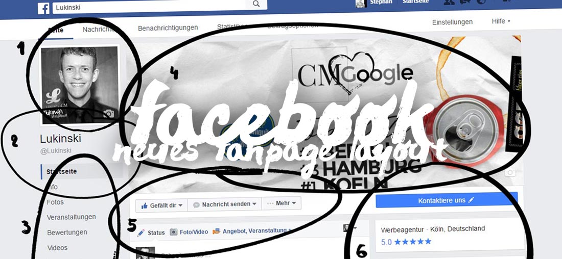
Basically, the layout adapts more to a really micro site. The navigation is clearer and larger. Contact options and other CTAs (“call-to-action” offers) are easy to use, more prominently positioned. The own profile picture takes more space and reminds me a bit of Twitter with the new @ statement. The cover image is now completely free and no longer blocked by distracting fonts or images. At a glance:
Larger profile picture on the Facebook Fanpage
Think Big! Instead of the usual look, which is the profile picture above the cover picture, Facebook is changing the layout to two separate elements. This makes the profile picture much more present and differentiates the fan pages from the “normal” Facebook profiles. The new design is very appealing, also the title picture is finally free of distracting elements.
Name and @ link for more tags
So that more is marked and linked is now also the @-link much more present than before. This is probably intended to encourage users to tag even more within Facebook. The advantage for companies, people and projects is clear: The more is marked, the more viral or present the brand in the social network.
Clear navigation in the fanpage
All media are now clearly packed in their own navigation, instead of in large boxes below each other as before. The navigation in the own Facebook Fanpage becomes so much easier for users. The overview is there immediately. Administrators can adjust the area at any time by clicking on “Manage tabs”.
Free cover image without disturbing fonts
The fact that Facebook is finally using a free cover image in the layout again is fantastic! Previously, photos and images always had to be specially cropped, adjusted and pushed so that it is not covered by distracting elements such as fonts, buttons and images. Now, the area of the cover image is uncovered, eliminating the need for elaborate design and making fanpages easier to run. This saves time, is chic – is successful!
Clear “Like” and contact area
Facebook has also optimized the call-to-action area. The “Like” button for users, as well as the contact option are much more present in the layout. This could increase the “Like” conversion on your own fan page. We will observe it!
Rating, interaction and sidebar for videos, photos & co.
Your photos, videos and other media are no longer on the left, but in the right column. Because the navigation now takes up the left side. The media are as before neatly displayed below each other, in small boxes. For administrators of the respective fan page are here, as seen in the example (above), the statistical values at a glance. Likewise, all visitors can find the rating of the page here – if it is a “local company”.
Conclusion – New Fanpage Design vs. Social Media Manager
Often, companies get bogged down when it comes to layout makeovers. Facebook’s new wave of fan page optimizations, however, is a real success. Fanpages are now much clearer. This makes it much easier for you as a business or social media manager to provide information on their Facebook Fanpage. Users can access it more easily. The separation of the cover image and information is really successful. Likewise, the new three-column layout of the page is great as content is now neatly structured from left to right. This eliminates the information and media overload and replaces it with a clear design. Well done, Mr. Zuckerberg!
Update. Feedback from a reader:
1. is your PSD template now still up to date for the new fan page on Facebook? (thanks!)
As the article says, no 🙂 Facebook has now separated profile + banner. The dimensions are correct, but you can now simply work with two separate images or graphics. So you need virtually no layout more, as still described in 2016 on > Facebook Fanpage Design PSD
2. is still linked small profile picture (180 x 180)?
My recommendation: Always use profile pictures in higher resolution (more than 180px). Often fans click on the image to look at it. It’s better to use a large image. For the Fanpage you can use your own profile picture in any case. Your Facebook Fanpage Channel is like your own profile, with your own photos, timeline, videos, news, etc.
https://lukinski.com/wp-content/uploads/2016/07/facebook-neues-design-2016-social-media-manager-fanpage-firmen-beratung.jpg5081100Stephan/wp-content/uploads/2024/04/lukinski-logo-real-estate-investment-germany-house-villa-off-market-clean.svgStephan2016-07-21 11:31:332022-04-03 08:23:53Facebook Fanpage for Companies – New Look, New Design for 2016


")